News, Updates & Announcements
Page 1 2 3 4 ... 6 7 8 of 8 pages with 22 results
May 22nd, 2017
A Secure, Encrypted Site (https)
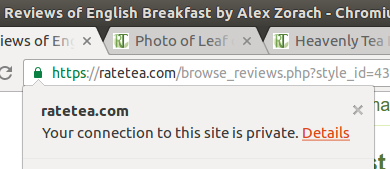
When RateTea was founded in 2009, it was a home-brewed site of low consequence. The site has never sold anything, and we do not manage payments or collect any credit card or banking info. Initially, the website didn't use any sort of encryption. The padlock icon shows a secure connection in Google Chrome.
In order to protect users, we have moved over to https, a more secure protocol.
Even before this, we have always stored our passwords in one-way-encrypted hashes. What this means is that (a) RateTea administrators cannot see or easily retrieve your password, even with full access to our database (b) if our site were to be hacked or compromised, the hackers could not see or easily retrieve your password.
What does the new security mean for you?
You don't need to do anything differently to benefit from the new encryption that we have implemented. Now, your email and password will be encrypted when you log on. Keep in mind, even with this security, RateTea is a public site and any other info you enter into the site can be displayed to the general public. Read our privacy policy for more details.If you use the same password at RateTea and other sites, and are concerned about the possibility that someone has intercepted your password in the past, we recommend changing your password (by logging in and using the Profile link in the top right, then the Change Password link on the profile page), not just here but on other sites where you have used this same password.
Keep in mind that security is only as strong as the weakest link in a chain. If you use the same password at different sites, there are still other ways that your information can be stolen, beyond eavesdropping, such as if a server is hacked, especially if the server actually stores passwords in plain text (there are a number of high-profile cases of companies doing this, and you don't have a way of knowing this ahead of time), so it is best practice to use a different password at each site!
Feb 28th, 2017
New Server, New Rating System
Our New, Faster Server
We are super excited to announce a successful move to a new server!
Our site has been growing a lot; in January we saw a record 67,000+ visits. Along with this, however, we had been seeing occasional slow-downs, with pages sometimes taking 10 or more seconds to load during the busiest times. What the new server means for you is that our site will be consistently faster and more responsive, especially during busier times when many people are viewing it. We hope most pages on our site will load almost instantly!
Another improvement we made on the new server is to add additional security to our domain and mail server settings. Hopefully this will also reduce the portion of our emails that had been marked as spam, a problem that some of our users have reported.
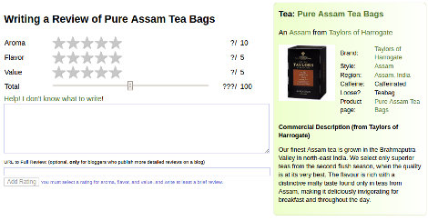
 A screenshot of the rating page.
New Rating System
Perhaps even more exciting than our new server is our new rating system! This system has been months in the works, and is in part a response to feedback we've received from a lot of users over the past few years. We hope this new system will make it easier and less intimidating to rate and review teas, and also make it a lot more fun!
How does it work?
- Star ratings instead of the old drop-down boxes. Aroma allows half-stars, translating into 1-10 ratings for finer detail. (You can experiment below!)
- It works better on mobile than the old system with awkward drop-down boxes.
- Total value is now a slider compared to the old system where you would select "overall" out of 10 and it would automatically calculate the total value. The slider populates automatically once you select the star ratings for aroma, flavor, and value, but you can then adjust it to any value from 0 to 100. This will allow more fine-tuning in your ratings, as well as the flexibility to give a higher or lower score than the aroma, flavor, or values would have allowed before.
- A “Help” button displays a box with tips and written examples to help you write your review.
- Tea info is on the right in a box, or above if you are on mobile, so you can see a bit of info on what tea you are reviewing, including its brand, style, and region of origin.
- Better-labeled “URL to Full Review” box. This is an optional field for people who publish more detailed reviews on a blog and want to leave a “teaser” with their RateTea review. If you review teas on your blog, this can be a great way of getting visibility and sustained visits to your blog: because RateTea is primarily used by people as a reference, it is not as time-sensitive as blogs, and will tend to send gradual traffic to your website over a longer period of time.
- Better user-experience in that the old rating box used annoying popups if you hadn't selected all the values. The new system discreetly dims out the button with a notice next to it, until you've selected all the buttons.
- 100% backwards-compatible with our old rating system. The old ratings are safe and sound, and have been converted to the new format. You can also edit your old ratings and fine-tune them using the new slider system if you want to tweak any to be a little higher or lower than before.
Try it out here:
| Aroma | ? | / | 10 | |
| Flavor | ? | / | 5 | |
| Value | ? | / | 5 | |
| Total | ??? | / | 100 |
Go and explore, rate some teas, or tweak your old reviews!
Jul 15th, 2015
RateTea is Now Fully Mobile-Friendly
 A screenshot of the new layout on a narrow browser.
When we first designed our site, we made it only with desktop and laptop computers in mind, but an increasing portion of our users (almost 40% now) have been accessing our site on smartphones and other mobile devices with small screens.
The menus in the site's header now collapse into buttons that you can click to show the menus in a vertical orientation. The left menu takes you to the different sections of the site (like the green bar in the header) and the right menu is for registered users, like signing up, logging on and off, or going to your profile or your list of tea ratings.
Every page on the site has been redesigned to collapse gracefully on small screens. Pages with multiple columns collapse into single-column layouts. Grids of images will now adjust the number of columns based on your screen width, and tables with many columns collapse into a different format past the point where they become difficult to read. The site's footer also reorganizes itself if it becomes too cramped.
One site for all devices, no apps necessary
We chose this approach, responsive design, so that you can use our site easily on smartphones without having to install a separate app, and so that all our users and visitors to our site, can access all features on our site, rather than favoring either desktop or mobile users.Apps require updating, whereas websites can be updated instantly without requiring users to download more software, so this allows us to make changes to the site display immediately for all users. We have also noticed that a common complaint from mobile users is that when companies design separate "mobile" websites, they often do not support all the features of the full website.
From here on, all new features to the site will be added in the new responsive layout, making them fully accessible from the start for both mobile and desktop users.
Try it out for yourself!
If you don't have a smartphone or other mobile device, or don't have it on hand currently, you can still see how the new design works by making your browser window narrower. Past a certain point, the layout will collapse.This means, as a side benefit, the site will now be easier to use if you have it open in a small window on your computer!

